SUNY
My Role: UX Designer and Researcher Project Duration: 2 months
The Problem
The SUNY website navigation was causing confusion among users. Page titles and colors were misleading; causing confusion among users (prospective students, current students and faculty).
We wanted to make the experience of navigating their site straightforward and stress free.
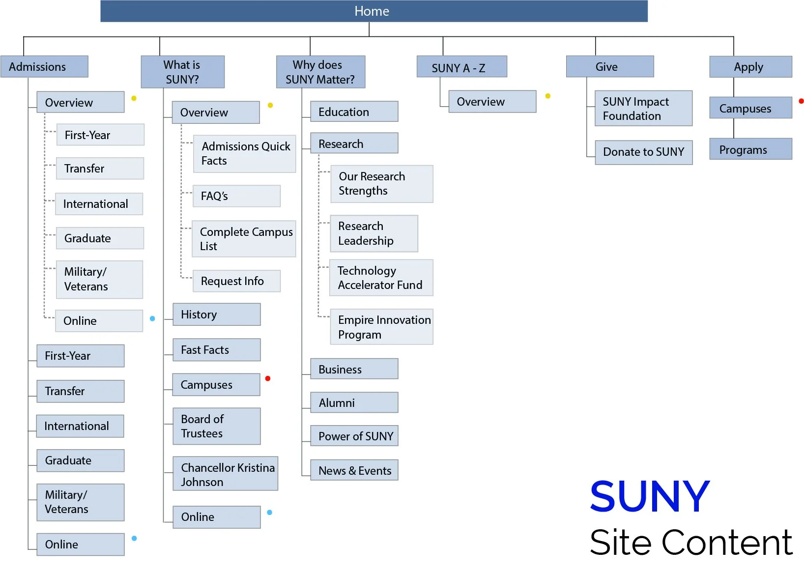
SUNY site map before updates.
Research Process
My team and I started by holding an exercise where users could evaluate the SUNY site map. We laid out all of the SUNY page titles on index cards and ordered them how they were represented in the original navigation. We then had multiple users come around and pick out any cards they had questions about. Many users picked out cards titled “What is SUNY” and “Why does SUNY Matter?” These users felt the page titles were misleading and confusing.
We also conducted a tree test with multiple users. In the tree test were three tasks that each user had to complete. The task that was the least successful and took users the most time was looking for a list of majors and minors. We kept this in mind while we re-organized our site map.
Solution
Our end solution resulted in a site map that had less main pages and subpages. This made browsing the site feel much more inviting and appealing to students, prospective students and staff.
SUNY site map after project updates
Design
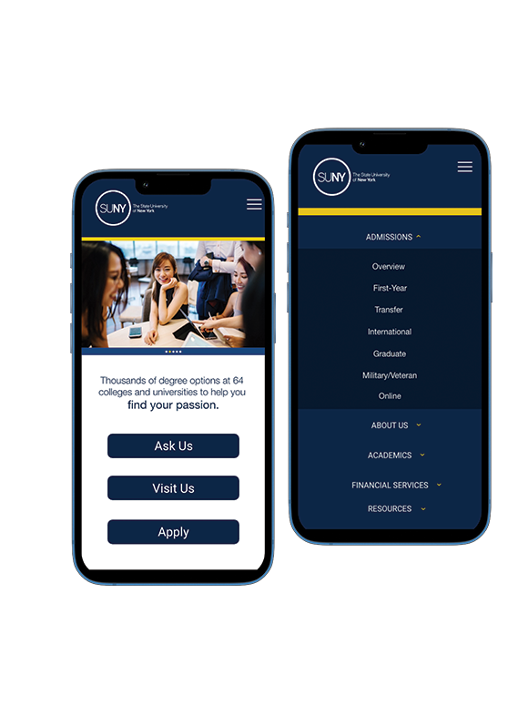
Navigation menu after updates
Navigation menu before updates
Homepage and navigation mockups


